

HOW TO TRANSFORMTHE DESIGN OF AN R SHINYAPPLICATION
DESIGN - UX - INDUSTRIALISATION
During the deployment of an R Shiny application, APPLITICS stepped in to enhance the visual design, optimize the user experience, and implement an authentication and access control system.
Objective: Optimize user retention and tool adoption during its large-scale deployment.
DIGITAL FUEL CAPITAL, an investment firm specializing in e-commerce, has internally developed a Business Intelligence (BI) tool. This tool is designed to provide leading companies in the industry with in-depth performance analysis, helping them identify new opportunities for growth and optimization.
This initiative reflects the company's commitment to providing not only financial support but also strategic and operational resources to help its partners excel in their niche.
The team wanted to industrialize this tool for its partners, but one key element was still missing: a design that could engage users and encourage them to share their experience. Additionally, it was crucial to create a dashboard that aligned perfectly with the company's visual identity.
IMPROVING THE UI/UX OF AN R SHINY APPLICATION DESIGNED FOR INDUSTRIALIZATION
During the deployment of an R Shiny application, APPLITICS stepped in to enhance the visual design, optimize the user experience, and implement an authentication and access control system.
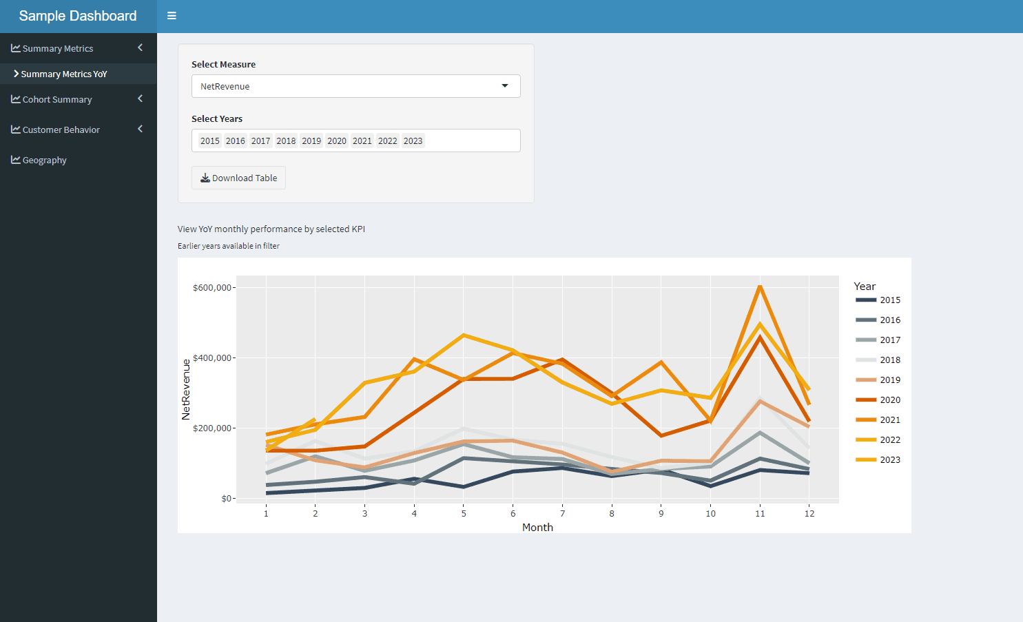
THE STARTING POINT OF THE APPLICATION
The application interface, initially developed by Jeffrey Coughlin, was designed using Shinydashboard and primarily included:
However, the user interface, with its classic Shinydashboard layout, was not yet suited for large-scale use.
In the backend, advanced analytical models were running, calculating key KPIs and generating detailed reports on the data from selected online stores.
The starting point of the application
CHALLENGES FACED
Jeff was confronted with two main challenges:
1. Setting up an authentication system
╰› In the first version of the application, data from all partners was stored in subfolders within the main data folder. To run the tool on a specific store's data, the team had to manually specify the appropriate subfolder in the code.
╰› With dozens of partners to manage, this approach was far from practical.
╰› To avoid this hard-coding, Jeff was convinced that an authentication system linking each user to their own data folder was essential.
2. Improve the design
╰› When looking at the initial version of the application, it was visually acceptable... at least for internal use.
╰› However, since this application is intended for key partners of the company, we wanted it to be enjoyable to use and to reflect the visual identity of DIGITAL FUEL CAPITAL.
╰› That's why Jeff insisted on bringing in experts.
HOW TO SET UP AN AUTHENTICATION SYSTEM FOR A R SHINY APPLICATION
When it comes to securing a Shiny web application, several technologies come to mind. Notably:
╰› Shinymanager: an R package developed by Datastorm. In addition to providing an authentication layer, it offers an admin panel to track application usage by each user, which can be very useful in certain cases.
╰› Shinyauth: another R package known for its flexibility in creating login systems based on custom user databases, as well as a simple user and role management system.
╰› Shinyproxy: a basic deployment solution. By using Docker, each application is isolated in its own container, which enhances security and simplifies resource management.
It is evident that all technologies lead to similar results.
With Jeff, we didn't hesitate for long before making our choice. We opted for the auth0 because the DFC team was already familiar with it.
The implementation of the authentication package is quite straightforward. There are several effective online resources available. This guide from curso-r is practical.
Once the auth0 package was implemented and the users were created, the next step was to link each user to their own data directory. For this, you just need to use the session variable: session$userData$auth0_info Once authenticated, this variable contains various information about the user.
Here is a simple example that illustrates this use case:
The reactive variable user_data$data_folder is then used within the application to load data from the right directory, depending on the logged-in user.
We now have an authentication system that links each user to their own data directory.
The next step naturally follows when you take a look at the default authentication page provided by auth0:
Auth0 default UI

It's already pretty good, but it would be even better if we could see DIGITAL FUEL CAPITAL's visual identity as soon as we land on the login page.
To do this, we connect to our auth0 dashboard, go to Branding, and then Universal Login. Here, we find several levels of customization. If you're familiar with web languages, you can choose the Advanced Options, where you can directly code the style.
I'll show you the result of the enhanced login page in the next section!
PREPARING A GRAPHIC MOCKUP
Design consists of two parts: User Interface (UI) and User Experience (UX).
Both of these elements are essential for the industrialization of a tool.
UI refers to the design of the interface, focusing primarily on its aesthetics.
UX includes everything related to how the user interacts with the application.
Simply put, the goal is to create a product that is both attractive AND functional. This is how you encourage people to use the tool.
UI and UX are specialized fields.
Since it's not my area of expertise, I reached out to an expert: Sundas.
I presented her the application, explained how it works, and outlined Jeff's goals.
I had no idea what the application would look like.
But when I saw the design, I immediately thought, This is exactly what was needed!
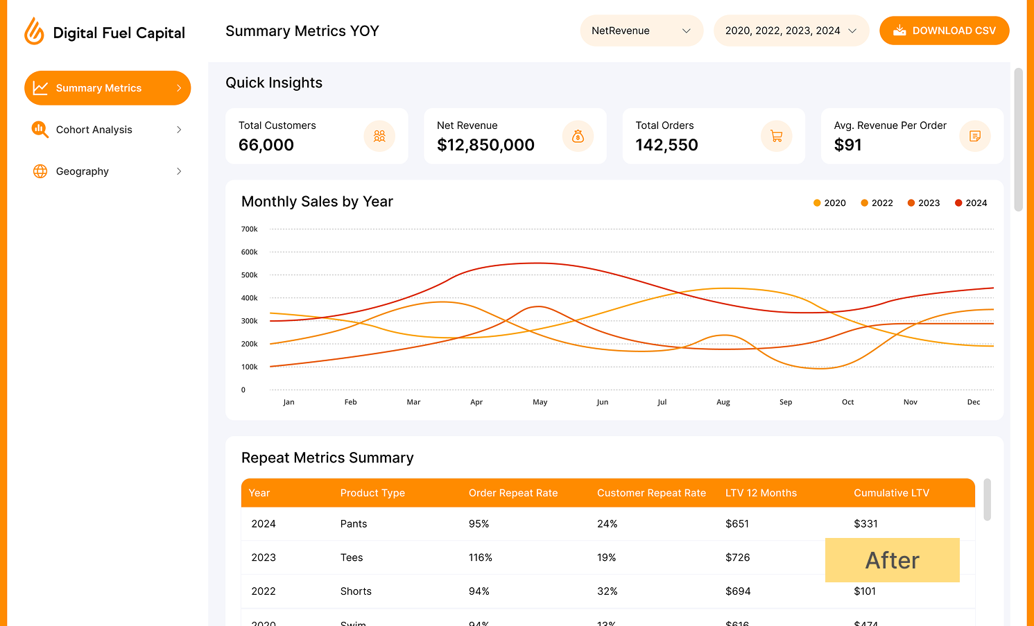
DIGITAL FUEL CAPITAL's brand identity is instantly recognizable.
Graphical Mockup of the new UI

I am sharing the link to the DIGITAL FUEL CAPITAL website for comparison: link
At this point... all that was left was to integrate everything into R Shiny.
And then...
The big question was: should we keep using Shinydashboard?
At first thought, it might seem like a good idea: this package offers a clean, pre-built sidebar with hierarchical integration capabilities.
However, in this case, we were looking for a high degree of customization, and our web development expertise allowed us to achieve that more efficiently.
So, starting from scratch and building the elements with HTML and CSS turned out to be a simpler solution for us.
BUILDING THE HTML SKELETON OF A SHINY APPLICATION
Creating the HTML structure is fairly straightforward.
Shiny uses Bootstrap by default, so you don't have to start completely from scratch.
Bootstrap offers many tools, like the ability to create a grid of columns using the fluidRow() and column() functions.
Here's an example of a dashboard structure:
And that's it! The rest is just about adding the content.
We use the id argument for the UI elements.
These id's will be widely used later in CSS to customize the appearance. They help create selectors.
Because, by default, the appearance won't be very aesthetic.
Now, we just need to code the visual part! For that, we need to use CSS.
ADDING STYLE TO AN R SHINY APP WITH SASS
My favorite tool for anything related to design is the Sass package, which is an extension of CSS.
Its main purpose is to organize CSS code, making it more readable and, most importantly, easier to write.
For example:
In CSS, this translates to:
The difference might seem minor at first. However, the CSS file lacks structure, and the selectors are much longer.
In this small example, it's still manageable. But when dealing with hundreds of lines of code, it becomes even more beneficial to structure and organize the selectors.
To use an .scss file within a Shiny application, there are two methods:
The traditional method involves installing the sass tool on your system and compiling the sass file directly with the command:
Or, even simpler, you can use the {sass} package developed by Posit (formerly RStudio). It will handle the work for you.
The layout has been successfully integrated.
However, there are some specific UI components: visualizations and inputs...
HOW TO CREATE APPEALING VISUALIZATIONS IN SHINY
Jeff initially used the ggplot2 library for the dashboard visualizations.
The goal was to enhance the visualizations by making them both more visually appealing, as outlined in the design mockup, and more interactive for a better user experience.
1. Choice of visualization library: Highcharter
After a brief study, two choices were shortlisted:
╰› Stay with ggplot2, adding more customisation and implementing a tooltip with the {ggiraph} package for interactivity.
╰› Rebuild the visualizations with another package: Highcharter
╰› On the one hand, ggplot2 is the visualization package used by default by R users. Its popularity provides it with redundant documentation and community strength.
╰› On the other hand, Highcharter, developed by Joshua Kunst, is an R wrapper for the Highcharts Javascript library, which is widely used on the web. It offers impressive levels of customisation thanks to a rich API that gives control over the entire graphic.
╰› As the developer describes the R package: "There's no default arguments. All arguments need to be named."
╰› In other words, this means you have full flexibility to use all the features of the Highcharts JS library within R.
╰› Highcharter allows an efficient use of JSON syntax through R lists to define and customize your charts. This works so well thanks to the similarity between R lists and the JSON objects used by Highcharts in JavaScript.
╰› For example, this chart in JS.
... becomes in R:
╰› However, beyond the static visualizations shown earlier in this case study, Jeff also wanted to implement a fancy feature—small additional charts that would display, in real-time, the evolution of certain pre- calculated metrics, updated by the second.
╰› For this feature, Highcharter clearly stood out as the best option for the project, thanks to its particularly elegant animations for real-time graph updates.
╰› Additionally, since the project policy didn't have any licensing restrictions, switching to Highcharts became an obvious choice.
2. How to create a graph that updates in real time with 'highcharter'
╰› Since the pre-calculated KPIs are confidential to DIGITAL FUEL CAPITAL, I have created an example with dummy data, still within the context of e-commerce.
╰› Let's say we want to display data showing the evolution of web traffic, with second-by-second accuracy, coming from a server API.
╰› Here's an example illustrating this:
Real Time Data evolution of web traffic with Highcharter
╰› In our example, API calls are simulated using the auto_invalidatevariable, which automatically resets every two seconds thanks to the reactiveTimer() function. This process is known as automatic invalidation in Shiny.
╰› In our fictional example, with each reset, random data is generated and incremented to the historical data.
╰› Then, adding a new point is handled directly by the proxy functions hcpxy_add_point() and hcpxy_set_data(), by specifying the series ID.
╰› You can find the code source here.
╰› You can also check out the live example here.
CREATING YOUR OWN WIDGET IN SHINY
In the context of industrializing a web application, the standard inputs provided by Shiny are clearly not visually sufficient, especially when trying to follow the company's design guidelines.
Here are both versions for comparison:
Custom Select Input

No surprise, the input designed in the mockup fits better into the DIGITAL FUEL CAPITAL visual universe.
To change the appearance of an input in a Shiny application, there are mainly two methods:
1. The quick & dirty method: This involves directly overriding the default style of a standard Shiny input. It's useful when you need to quickly tweak some minor adjustments.
2. The professional method: This involves developing a custom widget from scratch. It's more complex, but it allows for complete and integrated customization.
A good starting point for the quick method is to use the code inspector to temporarily adjust the visual style until you achieve the desired look. Then, you would simply add these styles to the header of your Shiny application.
The professional method, on the other hand, requires a bit more work. It involves creating a fully customized Shiny widget using basic HTML, CSS, and JavaScript components. This allows for total control over the widget's behavior and appearance, with the added benefit of increased reusability and maintainability.
For those curious, here are some interesting resources to get started:
In our example, here is the complete code: link
The R code: contains the HTML tags for the widget. It's simply an input tag.
The CSS code: used to follow the design guidelines.
The JavaScript code: this is where the code is found to turn it into a Shiny widget.
GOAL ACHIEVED!
Once in production, the application was enthusiastically received by all the company's partners, with a satisfaction rate of 100%.
It was a real success as soon as it was published. Online shop managers, as users of the tool, now have greater confidence in it, seeing it as a robust, professional solution for their business, rather than just a rushed dashboard. They recognize the quality and reliability of the tool, reinforcing their commitment and satisfaction.
Today, the tool is fully operational and is entering a phase of continuous improvement. The aim is to continue optimizing the user experience based on the feedback we receive. For example, we are working on integrating a benchmarking feature that will enable us to compare the analyses carried out by different partners in the same niche in a precise and structured way, so as to facilitate strategic decision-making based on reliable comparative data.